 Home
Home Slide
Slide
 Eastern
 Central
 Western
 Germany
 Netherlands
 France
 Accordion
 Fruits
 Breads
 Vegetables
 Meat
Meat Mega Menu
 Sherpas were immeasurably valuable to early explorers of the Himalayan region, serving as guides and porters at the extreme altitudes of the peaks and passes in the region. Today, the term is used casually to refer to almost any guide or porter hired for mountaineering expeditions in the Himalayas.
 Mixed
Mixed
 Link
Link Search
 Login
Login
Sherpa | Complete Navigation System
Welcome and thank you for purchasing Sherpa. As the name suggests, it is a total solution for all your navigation needs. Sherpa consists of three main elements - a Navbar, Sidebar and Footer each of which has a number of options including: Slide Menu, Mega Menu, Accordion Menu and Drop Menu. These can also be minimized/hidden to give your content even more space. Go ahead and try them out!
How to use Serpa...
Sherpa uses nested unordered lists to create the main navigation structure. By default these will act like standard slide out menus but by adding extra classes to the elements, you can create accordions, mega menus or drop menus. You can also use combinations of these types to make really unique user experiences. You can also control other things like the slide direction and nav widths simply by using classes. Sherpa uses 960.gs grid layout but can be easily modified to use any other css framework or just give it your own widths.
Navbar
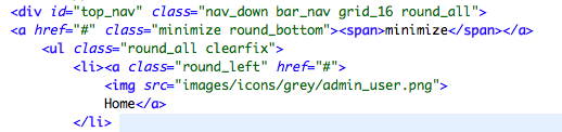 Class="bar_nav" gives this navigation type most of it's styling.
Class="nav_down" makes the menus drop downwards.
ID="top_nav" is used by the jQuery to target this nav bar as being at the top and so hide-able.
Anchor class="minimize" is used if you want to include the minimize toggle.
Class="bar_nav" gives this navigation type most of it's styling.
Class="nav_down" makes the menus drop downwards.
ID="top_nav" is used by the jQuery to target this nav bar as being at the top and so hide-able.
Anchor class="minimize" is used if you want to include the minimize toggle.
Sidebar
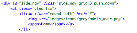 class="side_nav" gives this navigation type most of it's styling.
ID="side_nav" is used by the jQuery to target this side bar as being minimize-able.
Like the Navbar an anchor with class="minimize" can be included if you want to allow this functionality. Having the proper class on the partnering content area is important to make this work as intended (see below).
class="side_nav" gives this navigation type most of it's styling.
ID="side_nav" is used by the jQuery to target this side bar as being minimize-able.
Like the Navbar an anchor with class="minimize" can be included if you want to allow this functionality. Having the proper class on the partnering content area is important to make this work as intended (see below).
Content Area
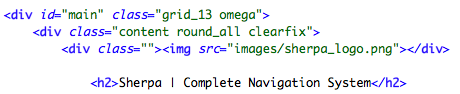 The content area should be wrapped with an element with id="main" if you intend to resize the sidebar and content area. This is so the jQuery can target it properly and animate the width property of both elements.
Footer
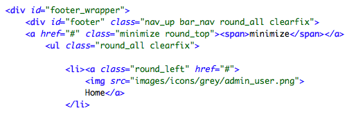 The footer has an extra wrapping element to allow it to centre and scale just like the Navbar but also sticking to the bottom. Note: If you prefer this nav to appear below the content like a normal nav then simplye remove the position:fixed; property and add float:left;
Class="nav_up" makes the menus rise upwards.
ID="footer" is used by the jQuery to target this nav bar as being at the bottom and so hide-able.
Anchor class="minimize" is used if you want to include the minimize toggle.
The footer has an extra wrapping element to allow it to centre and scale just like the Navbar but also sticking to the bottom. Note: If you prefer this nav to appear below the content like a normal nav then simplye remove the position:fixed; property and add float:left;
Class="nav_up" makes the menus rise upwards.
ID="footer" is used by the jQuery to target this nav bar as being at the bottom and so hide-able.
Anchor class="minimize" is used if you want to include the minimize toggle.
Slide Menu
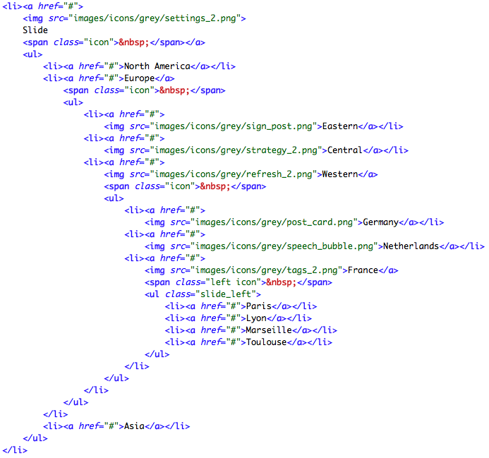 As stated before, this is the default behavior of Sherpa. It consists of nested unordered lists to achieve an unlimited menu depth. Placing a span with class="icon" will give you an arrow indicator to show there is further depth to the nav. This arrow will point downwards on the top bar, upwards on the footer, left/right on the slide menus, etc.
Accordion Menu
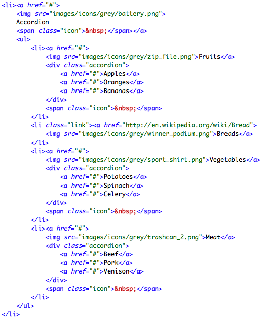 An accordion is achieved by placing a div with class="accordion" next to the anchor tag inside a list item. If the side nav is closed, clicking on a top level accordion item will cause it to open as it reveals it's contents. Logically the reverse happens if you close the side nav.
Mega Menu
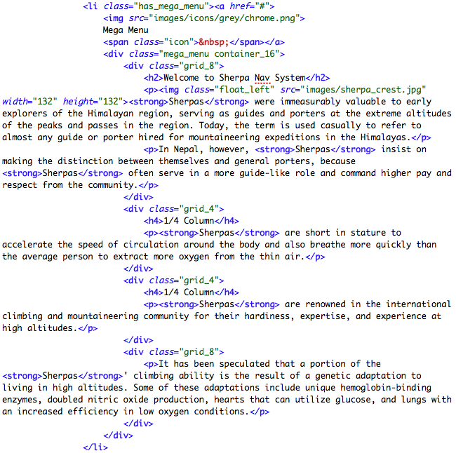 A mega menu is achieved in much the same fashion as an accordion, except the div element has class="mega_menu". Note the parent list item also needs class="has_mega_menu", this is so the menu can scale the full width of the page. The mega menu uses the 960.gs grid system to achieve multi-column layouts.
Drop Menu
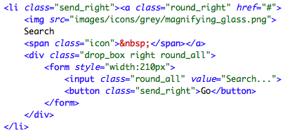 A drop menu is much like a mega menu but it can be any width you require. It is good for holding search boxes or login forms.
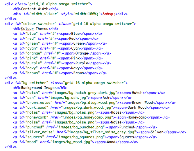
Sherpa Themes
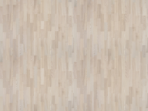
Sherpa comes with 10 different colour themes and 11 different backgrounds. By default Sherpa will be white with a dark hatched background. If you want a different colour, simply add a link to the stylesheet in the head section. To change the background image, simply change the css background-image property on the body. Sherpa comes with 500+ icons allowing for a very unique navigation.
Navigation Toggles
Sherpa allows the user to toggle the Navigation to maximize the space for content. This is done using simple javascript to animate some css properties. If you want to disable this, simply remove the anchors from the html.
Style Switcher
 The styleswitcher is a simple javascript function which adds a link to each stylesheet to the head section. It is quite easy to edit but you will probably not need this in your project so just add the stylesheet links manually and remove the switcher.